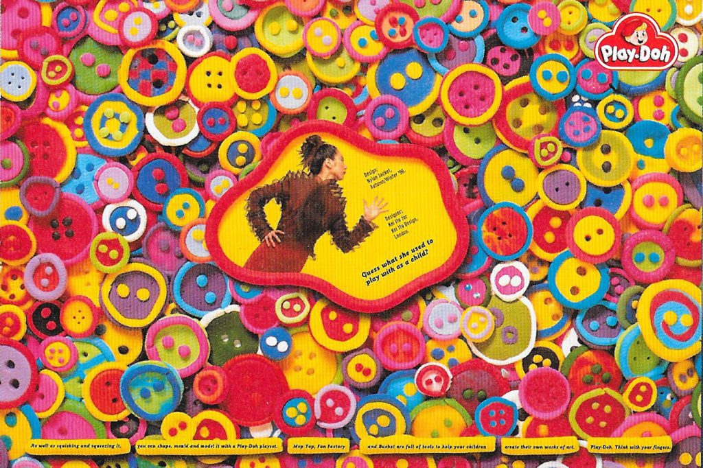
PLAY-DOH
Double Sided Press Advertisement
1998 - 2000
In the late 1990s I worked as a graphic designer at Howell Henry Chaldecott Lury (HHCL), an agency known for helping shape a more alternative and irreverent style of British advertising. HHCL’s approach challenged many of the conventions of the industry at the time and went on to have a significant influence on the tone and direction of British advertising.
During my time there I worked on campaigns for clients including Iceland, Tango, ITV, Pot Noodle, and Guinness. The agency’s iconoclastic attitude toward both the work and the industry created an environment where creative staff were given a great deal of freedom. That progressive atmosphere suited me well and reinforced my interest in bold visual ideas, conceptual thinking, and pushing beyond predictable ways of communicating.
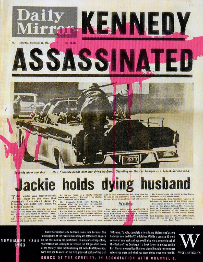
Waterstones
Press Advertisement
1995 - 1996
I worked as a graphic designer producing concept-to-artwork campaigns for clients including Jazz FM, Marlborough, and Thomsons. The work involved developing ideas through to finished visuals, balancing clear communication with strong visual impact.
This Waterstones press advertisement formed part of a wider campaign designed to help the bookshop move away from its conservative image and present something more contemporary and progressive. The aim was to give the brand a sharper, more confident voice, using bold design and concept-led advertising to reposition it within a changing cultural landscape.
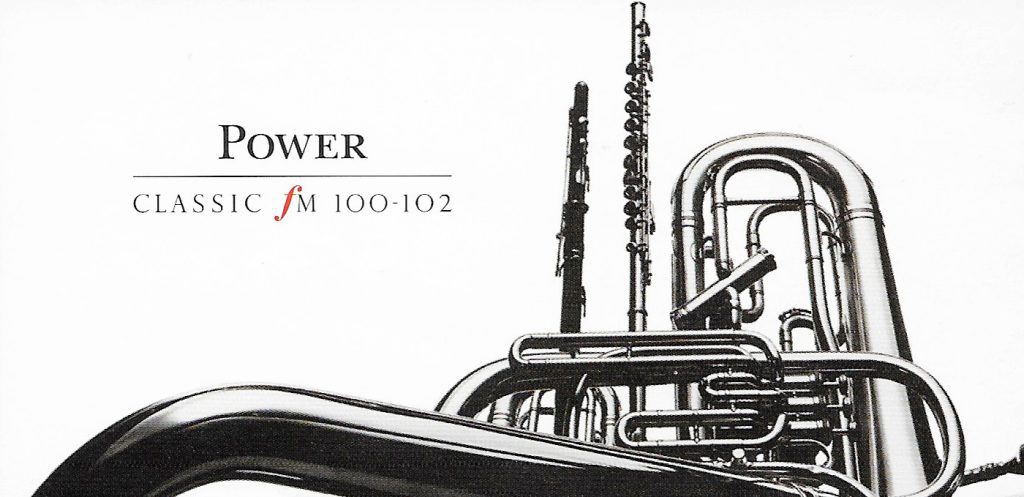
classic FM
48-sheet billboard
1995 - 1996
Another client during my time working on campaigns was Classic FM. I was part of the team involved in developing elements of a rebrand that aimed to refresh the station’s visual identity while maintaining its sense of authority and calm.
The campaign used a minimal aesthetic, built around close-up black-and-white photography of musical instruments. By cropping tightly into their forms, the instruments took on a monumental, almost architectural presence, while at other times appearing abstract and lyrical. The typography remained understated and confident, allowing the imagery and quiet tone of the design to communicate a sense of clarity, elegance, and musical focus.
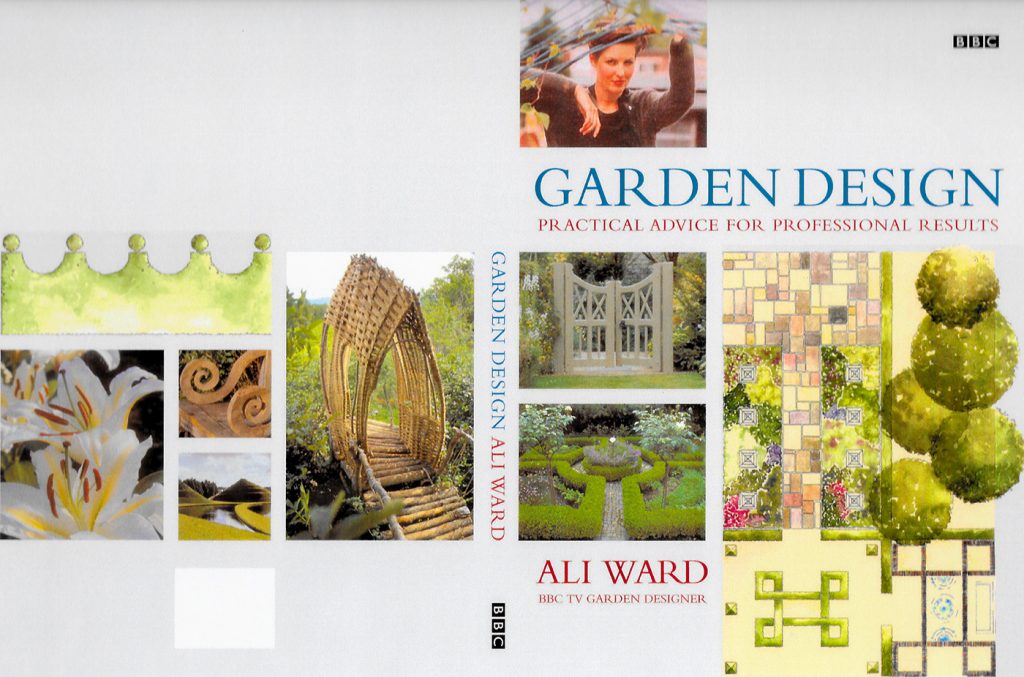
garden design
book cover
2000 - 2001
I worked as a typographer and artworker exclusively on book covers for BBC Worldwide. The role focused on developing and refining typography while preparing final artwork for publication. During this time I worked on a range of titles, including Blue Planet, Only Fools and Horses, and Harry Enfield.
The environment was very different from advertising. Instead of fast-paced campaign work, the process was calm, precise, and detail-focused. I enjoyed the discipline of this slower, more exacting approach, where typography, layout, and small visual decisions played a crucial role in shaping the final cover.

stamps for the European Union
Stamps
1991
Early in my design career I was the winner of a Royal Mail competition to design a series of twelve stamps for the European Union. The project brought me into collaboration with David Hockney and eleven other contemporary artists.
Meeting and speaking with Hockney remains a pivotal moment in my life. The experience, along with the press coverage that followed, helped launch my career and opened the door to working with blue-chip clients and leading advertising agencies. It was an early introduction to the power of ideas, visual communication, and the wider creative world I would continue to work within.
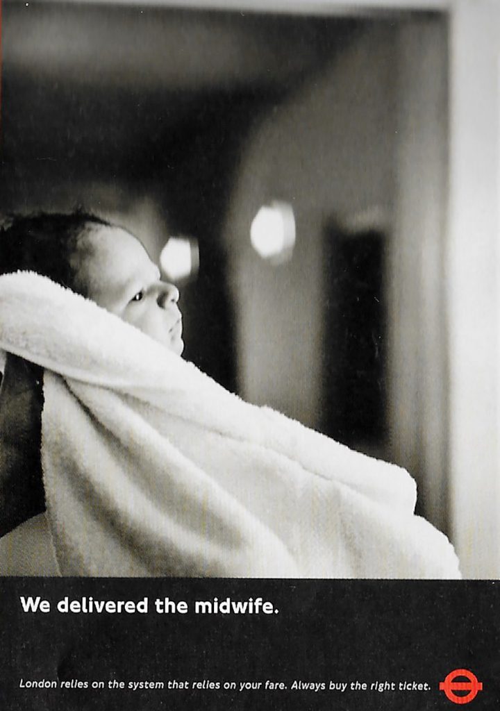
The London Undergroud
Double Royal Posters
1996
I worked as a typographer and designer on this poster campaign for the London Underground. The campaign relied on simple, powerful black-and-white photography, using strong imagery to tell a story, held together by a clear and concise strapline.
The design approach was deliberately minimal, allowing the photographs to carry the emotional weight of the message while typography quietly structured the composition. Collaborating with such talented photographers was inspiring and gave me a deeper appreciation for the expressive potential of photography—another small nudge that eventually led me to explore the medium more seriously in my own work.
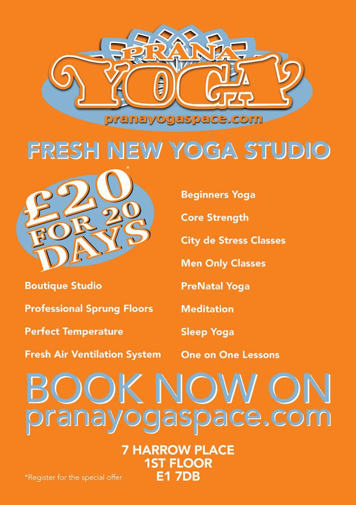
yoga studio
Branding
2016
After a change in career, while working as a holistic bodyworker, I continued to take on freelance design projects. Much of this work focused on branding for small businesses, helping them develop a clear and recognisable visual identity.
This often involved creating logos, defining colour palettes and typography, and producing a range of marketing materials such as flyers, business cards, product labels, and websites. I enjoyed helping small businesses shape how they presented themselves visually, combining clear design thinking with a practical understanding of how brands communicate with their audience.
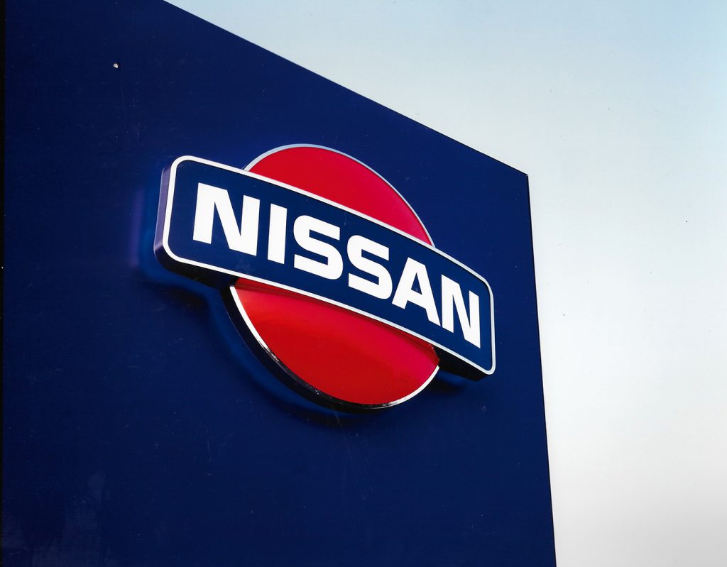
nissan
Re-branding
1993 - 1994
My first role as a junior designer involved being part of the team working on a major rebrand for Nissan. It was an early introduction to the scale and coordination required when developing visual identity for a national brand.
My role focused on ensuring that the signage for Nissan forecourts was clearly designed and consistently applied. I also helped produce branding documentation that guided how the design system should be implemented, allowing the concept to be accurately rolled out across dealerships nationwide. The experience gave me a strong understanding of how design moves from concept into practical, real-world application.
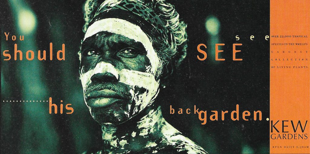
kew gardens
Double Page Press
1997
This press advertisement for Kew Gardens formed part of a campaign designed to feel more direct and contemporary than traditional garden advertising. The concept used striking photographic images of indigenous people alongside the strapline “You should see his back garden.”
The approach was intentionally more confrontational than the usual polite tone of horticultural advertising. As typographer on the piece, I developed a modern, edgy typographic treatment that could hold its own against the strength of the imagery. The design created a bold visual statement while subtly referencing the tropical origins of many of the plants associated with Kew Gardens.